When I enter a store, do I turn right, or left?
Is it easy for a customer to navigate around, and find what the are looking for? Are there a lot of gondolas segregating the store into sections?
What works for your store?
1. A grid store layout ?
- Enter : Check out, cast till, cart area
- Corner : Fresh fruits & Veggies
- Aisles : Food, Hygiene, Disposables etc
- Back : Storage, inventory etc
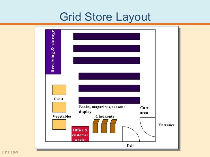
Thoughts :
- Cash tills must never be the first thing you show a customer. You remind them of spending money, and trigger a negative experience.
- Why is the fresh fruit & veggie counter so far out of the entry. In my opinion, it should be the first thing you show a customer. Make them feel good about spending money. Make them see the fresh fruits and smell the vegetables, instantly trigger a happy emotion.
2. Racetrack layout?
- Multiple entry & exit points between sections
- One section looping onto another
- Encourages exploration (sometimes too much that it distracts)
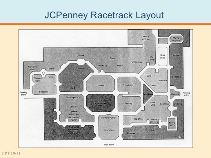
Thoughts -
- Mostly used in department stores for bags, shoes, apparel etc
- Like stated earlier, encourages exploration, and switching from one brand to another while staying in the same category, but procrastinates purchase decisions on the flip side
3. Free form
- Fixtures and aisles are asymmetric
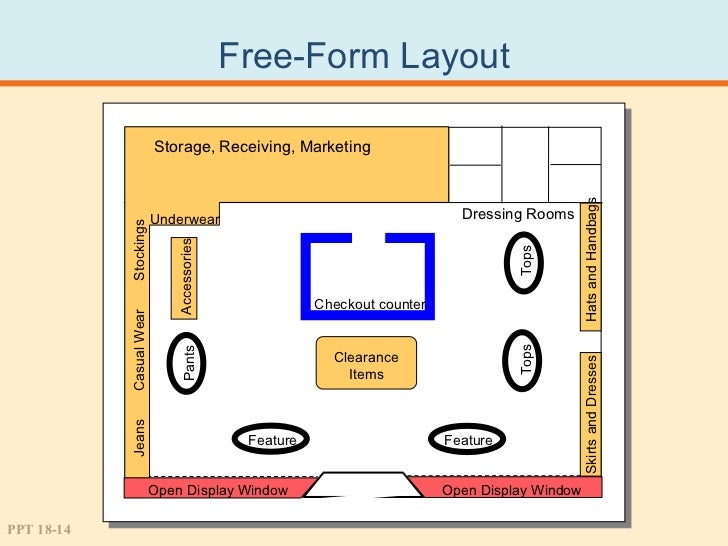
Thoughts -
- Inefficient use of space
- Weak, loosely defined navigation
- Dis organized, functioning more as a put off, than a relaxation fix (as originally intended)
Is it easy for a customer to navigate around, and find what the are looking for? Are there a lot of gondolas segregating the store into sections?
What works for your store?
1. A grid store layout ?
- Enter : Check out, cast till, cart area
- Corner : Fresh fruits & Veggies
- Aisles : Food, Hygiene, Disposables etc
- Back : Storage, inventory etc
Thoughts :
- Cash tills must never be the first thing you show a customer. You remind them of spending money, and trigger a negative experience.
- Why is the fresh fruit & veggie counter so far out of the entry. In my opinion, it should be the first thing you show a customer. Make them feel good about spending money. Make them see the fresh fruits and smell the vegetables, instantly trigger a happy emotion.
2. Racetrack layout?
- Multiple entry & exit points between sections
- One section looping onto another
- Encourages exploration (sometimes too much that it distracts)
Thoughts -
- Mostly used in department stores for bags, shoes, apparel etc
- Like stated earlier, encourages exploration, and switching from one brand to another while staying in the same category, but procrastinates purchase decisions on the flip side
3. Free form
- Fixtures and aisles are asymmetric
Thoughts -
- Inefficient use of space
- Weak, loosely defined navigation
- Dis organized, functioning more as a put off, than a relaxation fix (as originally intended)
No comments:
Post a Comment